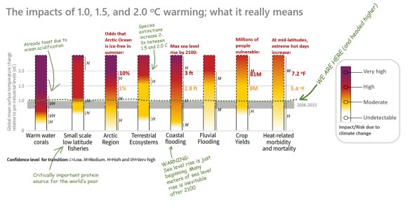
On October 6, 2018, the Intergovernmental Panel on Climate Change (IPCC) issued its Special Report on Global Warming of 1.5 °C (known at “SR15”), looking at the benefits of keeping global warming under 1.5 °C, as compared to 2.0 °C, and the potential pathways to get there. The report was commissioned after the Paris Agreement of 2015, which subjected nearly every nation in the world to voluntary goals for reducing greenhouse gas emissions. We are already at 1.0 °C and climbing, so this is a late-in-the-game analysis.
The results, based on the latest science, are sobering. While past IPCC reports were known for being rather conservative, largely due to political pressure, this one is more direct, practically screaming for a radical reduction in fossil fuel use (which must fall to near zero by 2060 even with a technological breakthrough in carbon sequestration). When it was approved, participating scientists cried tears of joy that their report, dire as it is, was allowed to be published as it was.
The full report, a little over 1,000 pages, is available in chapters here. It provides important details regarding the effects of climate change from region to region.
A 34-page summary for policy-makers is available here.
But even that summary is full of technical jargon that most politicians and members of the public would find cumbersome. Here I’ve taken some of the most important diagrams from the summary and modified and annotated them. Here is the report in three diagrams:
[CLICK TO ENLARGE]


